Greatest Album Covers of All Time – From 1967 to 2021
Album cover art in the past was a unique experience. It was not only about the music, but the artwork was also part of the journey. The covers were full-sized,…
StoriesAlbum cover art in the past was a unique experience. It was not only about the music, but the artwork was also part of the journey. The covers were full-sized, 12-inch canvases that were as much a piece of art as the music itself. The visuals could be as trippy, bold, or sophisticated as the artists themselves, and they would give you a hint of the journey you were about to embark on when you dropped that needle.
Today, with streaming and digital downloads, we’re lucky if we see the cover art as a small thumbnail on our screens. It’s almost as if we have lost that tangible connection to the music. Holding an album in your hands, studying the artwork, reading the liner notes, and getting lost in it while the record spins was a whole ritual.
And that’s part of the reason why people are getting back into vinyl. They crave that authentic, sensory experience. Luckily, the album cover art is still as alive as ever, and you’ll see some amazing examples on this list from recent years to prove that.

The album cover is the gateway to the music, a visual appetizer before the auditory feast. It sets the tone, hints at the stories inside, and sometimes, it even becomes as iconic as the music itself. Imagine Pink Floyd’s “The Dark Side of the Moon” without that prism, or The Beatles’ “Abbey Road” without the zebra crossing. The art is a silent ambassador of the album’s soul.
Now, think about holding a record in your hands, the weight of it, the texture of the sleeve. Flipping it over in your hands, you’re not just holding music; you’re holding a piece of art, a statement, a story without words. In a world where everything’s gone digital, that tactile connection is a rare treasure. It’s a multisensory experience that you just don’t get from a stream or a download.
Please note that the following album covers are not ranked in any way, because that is a highly subjective task. Instead, they are listed in the chronological order of their release, which seems to make the most sense. This way we can see how the design language evolved, what was popular back in the 60s, and what is popular nowadays.

The cover of Procol Harum’s debut album, released in 1967, is a breathtaking journey through a gothic wonderland. The artwork, with its intricate and Aubrey Beardsley-esque vibes, was created by Keith Reid’s girlfriend at the time, Dickinson, and it is truly one of a kind. It captures the vibe of the late ’60s era – it’s mysterious, slightly dark, but captivating – just like Procol Harum’s music. It’s a visual symphony that sets the stage for the sonic journey inside, from the iconic “A Whiter Shade of Pale” to “Conquistador.”

The Velvet Underground & Nico’s album cover from 1967 is the definition of coolness, with its iconic Andy Warhol-designed banana taking center stage. What sets it apart is not only Warhol’s pop art brilliance, but also the interactive design – the banana sticker could actually be peeled off to reveal a flesh-colored fruit underneath, a playful touch that mirrored the album’s theme of peeling back layers. It’s a tangible piece of counterculture history that blends art and music in a way that had never been done before. That banana is more than just a piece of artwork; it’s a symbol of the avant-garde and a hallmark of the underground scene that was reshaping music and art during that time.

“Sgt. Pepper’s Lonely Hearts Club Band” is an album cover that is considered to be a masterpiece. It perfectly captures the essence of the psychedelic vibe that was popular in the late 1960s. Designed by Peter Blake and Jann Haworth, the cover is unique because it features a mix of cultural icons. The Beatles themselves are depicted in groovy satin outfits, surrounded by a collage of historical figures. The cover was a groundbreaking piece of art that redefined the concept of album art. It became an interactive experience with cut-outs inside, inviting fans to join the band in this surreal, musical landscape. It’s not just a cover, it’s a landmark in pop culture that has become a legendary piece of art.
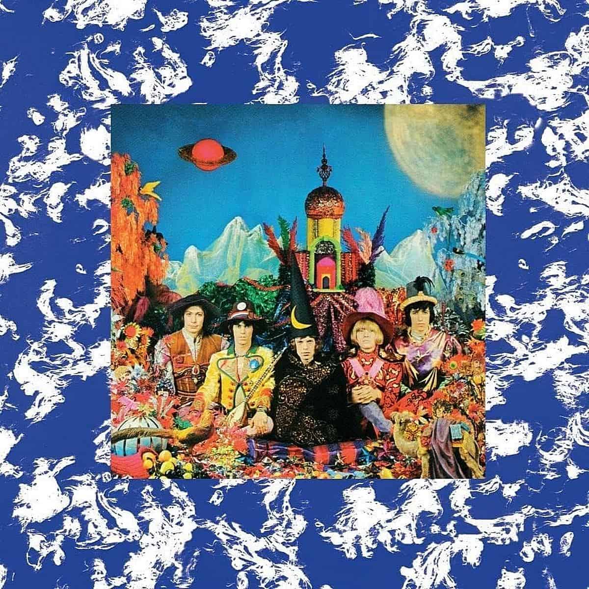
The album cover of “Their Satanic Majesties Request” by The Rolling Stones features a fascinating 3D lenticular image that shifts as you move it, creating a psychedelic effect. The cover is a witty response to The Beatles‘ “Sgt. Pepper’s Lonely Hearts Club Band.” The Stones took the idea of a grand and elaborate cover and added their own surreal and kaleidoscopic twist to it. This playful nod to their friendly rivals shows that they could delve into the world of psychedelia with the best of them, while keeping their edgy Stones spirit intact. The cover is not just a piece of art, but also a conversation starter, a rock ‘n’ roll banter, and a unique moment in the great Beatles-Stones saga.

Thelonious Monk’s “Underground” album cover is an exceptional piece of art. It features Monk portraying a member of the French Resistance, hiding in a war-damaged room, along with a tied-up Nazi in the background. The cover is an apt representation of Monk’s rebellion against musical norms. Designed by Jon Henry, it’s a visual jazz solo that breaks the rules, much like Monk did with his piano. It’s humorous, edgy, and tells a story, making it a unique and noteworthy piece of art. The cover art perfectly captures Monk’s artistry, which is unconventional, bold, and unforgettable.

“We’re Only in It for the Money” is a parody album cover by Frank Zappa and The Mothers of Invention. It’s a satirical take on The Beatles’ “Sgt. Pepper” album but with a unique Zappa twist. The art, designed by Cal Schenkel, imitates the iconic Beatles’ layout but features a cast of wacky characters and Zappa’s own band members looking freaky and fabulous. What sets it apart is that it doesn’t just make fun of The Beatles’ cover; it also comments on the commercialization of the counterculture. The album is like a snapshot of the 1960s but with a knowing smirk. What’s cool about it is that it’s not just art; it’s also a commentary on the music scene of that era, wrapped in Zappa’s irreverent humor.

“In the Court of the Crimson King” by King Crimson has one of the most iconic album art designs in history. The painting was done by Barry Godber, a friend of the band, who unfortunately passed away soon after the album’s release. The face on the cover is split between a screaming man and a more serene, moon-like visage on the inside gatefold. This captures the duality of human emotions and the complex, dynamic nature of King Crimson’s music. The cover art is not just cool, but also a profound piece of art that reflects the intensity and innovation of the progressive rock movement. It is similar to the Mona Lisa of album covers, where every glance reveals something new.

“Abbey Road” is a legendary album by The Beatles. The album cover is a simple photograph of the four band members striding across the zebra crossing outside of the Abbey Road Studios. The photograph captures an ordinary moment in time, yet it has become a cultural touchstone. The photograph has been analyzed for its symbolism, such as Paul McCartney being barefoot and out of step, which has led to many conspiracy theories. The photograph was taken by Iain Macmillan and represents the Beatles in transition, walking away from the studio where they made so much music. The photograph is not trying to be cool, it is effortless and captures a moment of rock history frozen in time.

Led Zeppelin’s first album, “Led Zeppelin I”, features an iconic image of the Hindenburg airship engulfed in flames, which was based on a well-known photo of the 1937 disaster. The artwork was created by George Hardie and symbolizes the end of an era, much like the band’s sound, while also being a playful reference to a conversation among musicians about their chances of failing miserably (hence the name Led Zeppelin). The album’s unique combination of blues and hard rock was revolutionary and had a lasting impact on the music industry. The cover art perfectly sets the tone for what listeners can expect to hear. (How Led Zeppelin created the cover art for their debut album).

“Bitches Brew” by Miles Davis is a phenomenal album that takes you on a journey into another dimension. The artwork for this album was created by the visionary artist Mati Klarwein, and it’s a psychedelic tapestry that perfectly encapsulates the groundbreaking fusion of jazz and rock within. The artwork is a surreal, vibrant landscape that’s just as mesmerizing and complex as the music itself. What makes it so special is that it’s not just a cover; it’s a visual journey. The artwork includes African influences, wild colors, and dream-like scenes that pull you into Davis’s innovative world. The album breaks boundaries and defies expectations, just like Miles did with this record.

The cover art of this album represents a significant change in The Beach Boys’ style, which used to be more whimsical. It showcases a painting based on the sculpture “End of the Trail” by James Earle Fraser, depicting a Native American slumped over on his horse, which symbolizes the exhaustion and the end of a journey. It’s fascinating because it reflects the band’s state at that time, who were tired from the challenges of the ’60s but still eager to explore new and more introspective themes. The cover art is unique because it’s a sharp contrast to the band’s name and previous themes, indicating a more mature, somber turn in their music. It’s as if The Beach Boys are telling us that the carefree days are over, and it’s time to face the realities of a changing world.

“Maggot Brain” by Funkadelic album cover has this intense image of a woman’s head screaming in agony or ecstasy—hard to tell which, right?—buried up to her neck in dirt. It’s the work of photographer Joel Brodsky. This cover is special because it’s a visual punch to the gut that perfectly matches the raw, emotional guitar work on the title track. It’s like the cover is channeling the same powerful vibe that Eddie Hazel’s guitar solos send through your spine. It’s cool because it’s not just an album cover; it’s a piece of art that dares you to dive into the depths of the music and feel every note with all your soul.

The cover of “Who’s Next” by The Who is an iconic image. Taken at Easington Colliery, it shows the band members in what appears to be a post-apocalyptic scene. The photo is a rebellious statement that matches the raw, powerful, and unapologetically rock ‘n’ roll music on the album. it cheekily references the massive structures of modern society, suggesting that the band’s music is equally monumental, and it breaks away from the typical glam of rock album covers, opting instead for a more realistic, gritty vibe that perfectly captures the band’s attitude and the counterculture of the era. The photograph was taken by Ethan Russell, and it has become one of the most unforgettable images in rock history.

Blue Öyster Cult’s self-titled debut album from 1972 is famous for its iconic hook-and-cross logo, which is actually a stylized Kronos symbol. This logo creates an aura of mystery and power that is as enigmatic as the band’s music. The logo is instantly recognizable and sets the stage for the band’s themes of the occult and science fiction that are present throughout their work. The stark black background with the white logo is a perfect example of simplicity in design, making it stand out on any record shelf. It’s not just a band logo, it’s a symbol that has become synonymous with Blue Öyster Cult’s style of hard rock and heavy metal, leaving a lasting impression on rock iconography.

Pink Floyd’s “Dark Side Of The Moon” album cover is considered the holy grail of album covers. It was designed by Storm Thorgerson and Aubrey Powell of Hipgnosis. The cover is a simple yet profound image of a prism refracting light into a rainbow. It’s unique because it’s a visual representation of the album’s themes of light, darkness, and the spectrum of human experience. The cover is timeless and universal, with no text or title needed, the image alone became synonymous with the band and the album. It captures the essence of the band’s music; complex, rich in layers, and utterly mesmerizing. (The Story Behind Pink Floyd’s Dark Side of the Moon Album Cover)

“Relayer” is the 7th album by Yes, released in 1974. Created by artist Roger Dean, the album cover features a grand castle that complements the band’s symphonic prog-rock sound. The artwork is iconic and synonymous with the band and the entire genre of progressive rock. It’s a beautiful visual symphony, blending colors and shapes together to create a surreal fantasy world.

The cover art of “Wish You Were Here” by Pink Floyd is a masterpiece of visual artistry. Its surreal imagery, featuring two businessmen shaking hands, one of whom is on fire, packs a symbolic punch that resonates with the album’s themes of absence and the cold nature of the music industry. What’s really cool about the artwork is that it captures the essence of the band’s message without using a single word. Its stark imagery conveys a sense of disconnection and loss, inviting the viewer to look deeper and find their own meaning within the flames. The album cover is more than just a visual accompaniment to the music; it’s a piece of art that tells a story. The black shrink wrap and the hidden postcard also add to the mystery and intrigue of the package, making it like a puzzle that Pink Floyd fans are still piecing together decades later. This is the mark of true iconic art.

The album cover of “News Of The World” by Queen is an incredible work of art. It was created by Frank Kelly Freas, a sci-fi artist, and features a giant robot holding the lifeless members of the band with a look of confusion and innocence. The image is striking and thought-provoking, as it explores the relationship between technology and humanity. The album’s music is equally raw and sophisticated, which complements the cover art perfectly. What’s amazing about this cover is that it’s not just a visual representation of the album, but it’s also a conversation starter that ignites the imagination and curiosity of its viewers. Moreover, the cover has stood the test of time and has become almost as legendary as the band itself.

Boston’s debut album cover is a masterpiece of imagination by Roger Huyssen, overseen by Paula Scher. It features intergalactic guitars-turned-spaceships that scream rock ‘n’ roll space odyssey. The artwork mirrors their epic anthemic tracks, blending futuristic and classic elements. It takes you on a journey before you even play the vinyl. The cover is a slice of rock history with a loyal following that encapsulates the era and excitement of their debut.

The album cover art for Aerosmith’s “Draw the Line” is quite unique and cool. It has a distinctive caricature vibe that was created by Al Hirschfeld, who is a legend in his own right. The way he captured the essence of the band with those fluid, exaggerated lines is simply amazing. The cover has a pure ’70s rock ‘n’ roll feel, and it’s as bold and raw as the music etched into the vinyl it protects. Every time you see it, you just feel like picking up the album and playing it. It’s a real piece of art for collectors who are into the scene.

The album cover of “Rumours” by Fleetwood Mac is a work of art that perfectly captures the essence of the era. Mick Fleetwood stands tall and exudes mystical vibes, while Stevie Nicks wears her ethereal “Rhiannon” costume, creating a visual story that reflects the band’s emotional turmoil at the time. The whole aesthetic, with its antique feel and sepia tones, is like a snapshot of their inner world. It’s an iconic piece of art that is shrouded in mystery, and it has a depth of emotion that draws you into the album’s legendary tracks. It’s not just an album; it’s a piece of rock history.

The cover of “London Calling” by The Clash is just as explosive as the record itself. It features a photograph of bassist Paul Simonon mid-smash on his Fender Precision Bass, taken by Pennie Smith at a New York City show. The image captures the raw energy of the band, just about to burst off the sleeve. What makes it truly special is how it pays homage to Elvis Presley’s self-titled debut album with its pink and green lettering, but with a punk twist that’s all about rebellion and the power of rock. It’s the perfect combination of music and image that defines a cultural shift, a moment in time. This cover isn’t just cool, it’s a battle cry in the form of art, signaling the start of a revolution on vinyl, and you can feel it every time you lay your eyes on it. (The Story Behind the Famous ‘London Calling’ Album Cover by The Clash).

The cover of “Unknown Pleasures” by Joy Division is a truly remarkable piece of art that resonates on a whole different level. It features a simple, yet arresting image of radio waves emanating from a pulsar. The stark contrast of black and white creates a cosmic effect that is hard to ignore. The way the lines on the cover ebb and flow, it’s like a visual representation of sound, or perhaps even the ups and downs of life itself. Designed by Peter Saville, it’s a masterpiece of minimalism that has become an iconic symbol of pop culture.

The cover of “Moving Pictures” by Rush is a masterpiece of wordplay. It’s one of those rare cases where a single image can convey multiple meanings and leave you in awe. Firstly, the image depicts movers carrying paintings out of a building, which is one of the meanings. Secondly, it portrays a crowd of people being moved emotionally by the artwork, which is the second meaning. Finally, the back cover showcases a film crew recording a movie scene, which is the third meaning. The cover art, which was designed by the brilliant Hugh Syme, is a clever visual pun that perfectly captures the album’s title. It’s a work of wit and intelligence, and it’s one of those covers that makes you appreciate the thoughtfulness that goes into visual storytelling.

The album cover of Iron Maiden’s “Powerslave” is an epic work of art, created by the renowned Derek Riggs. It immerses you in ancient Egypt with its pharaohs and pyramids and is a visual delight. The cover is an intricate tale in itself, with layers of symbolism and Riggs’ artistic brilliance. It perfectly captures the essence of the band’s heavy metal sound, with Eddie as the all-powerful pharaoh. The vibrant colors, meticulous details, and how it complements the album’s themes make it like a history lesson and a metal manifesto all rolled into one. It’s a timeless classic in the world of album art, and a must-see for all music and art enthusiasts.

The album cover of Pink Floyd’s “A Momentary Lapse Of Reason” is like a surreal dream that has been captured in time. It depicts hundreds of hospital beds scattered across a beach, which is hauntingly beautiful and thought-provoking. The cover was designed by the visionary Storm Thorgerson, and it symbolizes the isolation and occasional lapses of reason that we all experience. The starkness of the beds against the natural backdrop speaks volumes without saying a word. It’s one of those album covers that invites you to dive deep into its meaning every time you look at it. It’s a true masterpiece that perfectly captures Pink Floyd’s return to the music scene in the late ’80s.

Nirvana’s album “Nevermind” has one of the most iconic album covers in history. The image of a baby underwater, reaching for a dollar bill on a hook, perfectly captures the essence of the grunge scene in the early 90s. It’s not just an image, but a statement about society’s greed and the loss of innocence that comes with the pursuit of wealth. The album cover is more than just a picture; it’s a representation of the disillusionment felt by a whole generation. Its enduring allure is enhanced by the various interpretations that have been attached to it over time. The story behind its creation only adds to its legendary status. (The story behind Nirvana’s ‘Nevermind’ album cover).

The cover art for Rage Against the Machine’s self-titled debut is incredibly intense and raw, just like the tracks within. It features the powerful image of Thích Quảng Đức, a Vietnamese Buddhist monk, self-immolating in protest. The stark reality of that photo against the bold logo is striking. It’s political, historical, and incredibly moving. There’s no ambiguity with this one; it’s a visual punch in the gut that embodies the band’s fierce message and revolutionary sound. It’s more than just album art; it’s a symbol of defiance and a piece of protest history. You can’t help but respect the unapologetic bravery in both the music and the cover choice. For more details on the story behind this iconic cover, check out Wikipedia’s page on the album.

The album cover of Green Day’s “Dookie” is considered iconic for its chaotic and cartoonish depiction of a scene from Berkeley’s Telegraph Avenue. The artwork, created by Richie Bucher, is filled with in-jokes and references that make it a fun experience to explore. It’s like a punk-rock version of “Where’s Waldo?” that perfectly represents the band’s anarchic spirit and the raw energy of the early ’90s scene. The cover captures the essence of youth rebellion with dogs and monkeys causing chaos, and it oozes the band’s attitude. The cover’s vibe is as unforgettable as the album itself; it’s fun, irreverent, and pure Green Day.

The album cover of “Mellon Collie and the Infinite Sadness” by The Smashing Pumpkins is a visual representation of a Victorian-era dreamscape. The illustration, created by the talented artist John Craig, depicts a young woman with starry eyes set against a background of deep blues and twilight hues. This image perfectly captures the vast emotional range of the album, from joy to sorrow and everything in between. The artwork invites the viewer to delve into the soul of the record and explore the depths of its themes. It’s a timeless piece of art that’s as infinite as the sadness it portrays. For a glimpse into the story behind this iconic album cover, you can read more on NPR’s article.

The album cover of The Cranberries’ “Bury The Hatchet” is a work of art that leaves a lasting impression. It was designed by the legendary Storm Thorgerson and features a surreal, wide-open landscape with a giant, brooding eye peering down at a solitary, naked figure. This visual representation conveys the themes of vulnerability and the all-seeing nature of the world. The cover art reflects the band’s raw lyrical content and their return to the music scene after a short hiatus, delving into themes of exposure and introspection. It’s not just an album cover; it’s a piece of art that encapsulates the essence of The Cranberries during that era.

The album cover of Red Hot Chili Peppers’ “Californication” is a perfect reflection of the late ’90s cool. It depicts a classic California scene featuring a pool overlooking peaceful mountains, but there’s a surreal twist that’s uniquely Chili Peppers. The cover art, with its bold and straightforward imagery, captures the essence of the album’s critique on the Hollywood lifestyle and the dark side of California’s glitz and glam. The cover art is like a sunny dream with a touch of a dystopian world. It’s an iconic piece that perfectly represents the band’s sound and the era in which it was created. If you’re intrigued by the cover art and want to delve deeper into its meaning, there’s an interesting discussion on Reddit about it that you might enjoy.

This piece of art was created by the talented artist Stanley Donwood, who has been collaborating with the band since the 1990s. The artwork is a beautiful and haunting landscape that feels both strange and familiar. The colors used in the artwork are icy blues and whites which gives off an atmosphere of isolation and introspection that is in perfect harmony with the experimental sounds of the album. The cover art is a visual representation of the music’s chilling detachment and technological unease. It is more than just a picture, it is a mood, a statement, an experience that is embedded in the essence of the music itself. The story behind the artwork’s creation is just as fascinating and you can check it out in this article by Rolling Stone.

The album cover of Coldplay’s “A Rush of Blood to the Head” is a masterpiece of minimalism. Designed by the talented Sølve Sundsbø, the cover features a ghostly, incomplete 3-D rendering of a human head, which is both simple and complex, just like the band’s music. The grayscale palette gives a stark, almost haunting vibe, which perfectly captures the depth and emotion of the songs in the album. It’s not loud or over-the-top; it’s subtle, thought-provoking, and cool. The album art is not just something that sells the record, but it’s also something that makes you want to frame it.

The cover of Animal Collective’s “Merriweather Post Pavilion” is a masterpiece that can mess with your mind. It’s an optical illusion that captivates your senses, designed by Abby Portner, Avey Tare’s sister, and Rob Carmichael, who has worked with the band before. The artwork perfectly captures the psychedelic nature of the album, with its moving and lively patterns that seem to dance before your eyes, immersing you in the experimental and captivating soundscape of the music. It’s a doorway that leads you to the mind-bending journey that each track offers.

The album cover of “Cosmogramma” by Flying Lotus is an extraordinary experience that mirrors the music it holds. The artwork was designed by Leigh McCloskey, who created an intricate and ethereal cosmic vibe. The cover is a visual delight, with a fusion of textures and patterns that capture the essence of FlyLo’s music. The blend of organic and digital elements in the artwork reflects the album’s fusion of jazz, electronic, and hip-hop sounds. It’s the kind of cover that makes you stop, stare and lets your imagination run wild, just like the beats inside.

The album cover of Gorillaz’s “Plastic Beach” is a snapshot of a twisted paradise that perfectly captures the themes of consumerism and environmental issues that the album explores. The artwork features a cool pastel color palette and an iconic synthetic island made of junk, which is visually appealing and thought-provoking. It highlights the throwaway culture that we live in while also maintaining the classic Gorillaz style with a touch of whimsy. The cover is a visual representation of the band’s commentary on the world and sets the tone for the eclectic mix of sounds that you are about to experience. It’s not just an album art; it’s a piece of modern social commentary.

The cover of Kanye’s album “My Beautiful Dark Twisted Fantasy” is undeniably iconic, even if you’re not a fan of the music. It was created by the contemporary artist George Condo and is a raw, thought-provoking piece that’s just as complex and layered as the album itself. The artwork is a surreal portrait in a baroque style that’s both jarring and fascinating, much like Yeezy’s music. It’s a mix of the grotesque and the beautiful, visually representing the album’s themes of fame, power, and the human psyche. The cover was so bold that it caused quite a stir and was even banned by some retailers, which only added to its legend.

The album cover for Tame Impala’s “Currents”, designed by Robert Beatty, is a stunning display of psychedelic art. The swirling marbling of colors in the artwork perfectly captures the essence of transformation and the constant flow of life’s changes, which is what the album is all about. It’s a visual journey that represents the mind-bending, introspective nature of Kevin Parker’s music. The way the colors blend into each other, creating a vortex of hues, is a metaphor for the merging of genres and ideas that Parker is known for. The concept, inspired by a phenomenon called “vortex shedding,” is a testament to the thought and creativity that goes into album art.

The album cover for STRFKR’s “Being No One, Going Nowhere” is a retro-futuristic gem that perfectly matches their indie-electro sound. The cover art echoes the album’s themes of searching for meaning and finding peace within the chaos of existence. This kind of art is both nostalgic and timeless, and the way it combines danceable beats with enigmatic lyrics makes it even more alluring. The cover is not just a decoration for the record, but sets the tone for the auditory adventure that STRFKR takes listeners on with their tracks.

The album cover of “Yodh” by Mizmor showcases a painting created by the renowned Polish artist, Zdzisław Beksiński. The painting is a haunting and captivating depiction of a dystopian world, characterized by desolation and decay. This resonates well with the heavy and existential themes of the album, which is a fusion of black metal and doom. The intensity and evocative nature of the cover art draw you into the music’s oppressive atmosphere even before playing the record. This is the type of art that stays with you, like a vivid nightmare that’s both awe-inspiring and terrifying.

The album cover for Nine Inch Nails’ “Add Violence” EP has an old-school, analog machine vibe that’s intriguing. It’s like a piece of forgotten technology from a bygone era, with mysterious dials and switches. This is a cool metaphor for the way NIN’s music gets under your skin and tweaks your emotions. The cover art feels like a puzzle, inviting you to decode its meaning, much like the layers of sound and texture Trent Reznor and Atticus Ross are known for. It’s not just a picture, it’s an interactive experience that complements the EP’s exploration of the darker sides of humanity. It’s a perfect visual representation of the control we seek and the chaos we navigate, mirroring the themes within Add Violence.

Tyler, the Creator’s album “Scum Fuck Flower Boy” has an amazing cover. It features a mix of vibrant colors that immediately grab your attention, with buzzing bees, blooming sunflowers, and Tyler chilling in the foreground, all painted by the talented artist Eric White. The cover art is like a window into Tyler’s soul, contrasting the harshness of “Scum Fuck” with the beauty of “Flower Boy,” capturing the duality of his music and persona. The artwork has an organic, handcrafted feel that’s a refreshing break from the digital age, and it perfectly mirrors the album’s introspective and transformative journey. It’s not just an eye-catching cover; it invites you into Tyler’s world, setting up the lush, genre-blending soundscape that awaits inside. If you’re into the backstory and artistic process, there’s some cool insight from the artist himself on Complex.

The cover of “Titanic Rising” by Weyes Blood is a captivating and surreal art piece shot by Brett Stanley. It depicts the album’s themes of apocalyptic love and the weight of the world. The artwork complements the introspective journey of the album and is a conversation starter. It draws people in and stays with them long after the music ends. There’s a cool behind-the-scenes look at how they brought the underwater cover art to life, which you can check out on Brett Stanley’s website.

The album cover for “Swim Slowly” by Meltt is a truly ethereal piece that evokes a strong mood. The image invites you to take a moment, to breathe, and let the world around you fade away as you immerse yourself in their music. The cover has a simplicity that is really striking – it is not overdone, just a pure visual representation of the vibe that Meltt is going for. When you see this cover in the store, it promises an immersive and chill experience and sets the tone for the introspective journey that the album takes you on. It’s the kind of cover that doesn’t just sell the record, but sells the whole atmosphere.

Thank You Scientist’s “Terraformer” cover is a creative explosion that captures their eclectic prog-rock style. The intricate and vibrant art has a steampunk vibe with a touch of whimsy, showcasing a world teeming with life and imagination. It’s the kind of artwork that you can admire for hours. When displayed in stores, it’s a conversation starter, leading listeners to the audacious sonic adventure inside. The art is fitting for an album that’s all about pushing boundaries and exploring new territories.

Tame Impala’s album “The Slow Rush” has an incredible cover that captures the essence of its exploration of time. The surreal, timeless room filled with sand is a beautiful nod to Kevin Parker’s blend of psych-rock and introspective soundscapes. The cover was created by photographer Neil Krug and is a powerful symbol of humanity swallowed by the landscape. It’s a piece of existential art that’s as thought-provoking as the music itself. Check out Neil Krug’s website to see more of his work.
Album covers have always been more than just a way to package music. They are works of art and visual representations of the music they contain. Iconic album covers like Nirvana’s “Nevermind” and The Velvet Underground’s self-titled album have become cultural touchstones that are instantly recognizable to people around the world. These covers have had a profound impact on the way we view music and the world around us.
They have always been a way for artists to make a statement about their music and the world they live in. The Clash’s “London Calling” and Paul Simonon’s smashing bass guitar on the cover of “Never Mind the Bollocks, Here’s the Sex Pistols” are both examples of album art as a reflection of society. These covers were a way for the artists to express their frustration with the world around them and to make a statement about the issues they cared about.
As we’ve hopefully demonstrated in our list of greatest album covers of all time, it’s essential to recognize that album art is far from a relic of the past. In today’s digital landscape, artists continue to pour their hearts and souls into creating visually stunning artwork that encapsulates the essence of their music. The resurgence of vinyl records has reignited the tactile experience of music consumption, promising a bright and engaging future for album art design.
This revival not only celebrates the rich history of album covers but also ensures that the art form will continue to play a significant role in the way we appreciate music. The tangible nature of vinyl invites listeners to connect with the artwork on a deeper level, suggesting that the canvas of album covers will remain a key element in the storytelling of music for years to come.